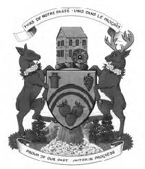
Coat of Arms, Frelighsburg
(Photos : Courtesy of James Croft)
Last fall, Le Saint-Armand received an email from Mr James Croft from Massachusetts. Mr Croft had travelled to Eastern Townships and came across our paper in Cowansville and thought we might be interested in some information he had on the coat of arms of two municipalities of our region. We are reproducing here the documents sent by Mr Croft.
Frelighsburg
Arms
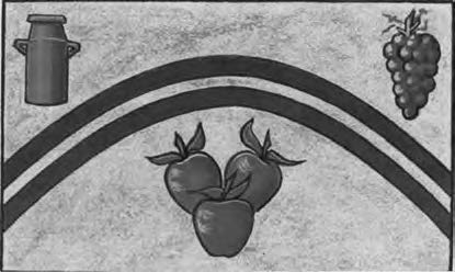
The elements of the shield recall the natural wealth of Frelighsburg. The two parallel curved lines represent mount Pinacle. This structure dominates the field in the same way that Mount Pinnacle is a distinguishing feature of the municipality’s landscape. The antique milk can symbolize the past and the dairy industry, particularly strong from 1930 to 1940. The three apples represent the present and the three generations of apple growers. The bunch of grapes symbolizes winemaking and the future. The yellow background also represents agriculture in general.
Crest
The mill recalls the first flour mills and sawmills built beginning in 1794, and which were economic pillars of the region at that time. Supporters
Deer are commonly found in the region. The apple blossom collars represent the abundance of the fruit in the area. The white pines symbolize the local flora, while the waterfall represents Hunter Falls and the rivière aux Brochets.
Motto
PROUD OF OUR PAST calls for the preservation of the municipality’s natural resources (mount Pinacle, the rivière aux Brochets, fauna, flora and the rural landscape) and heritage (Loyalist inspired heritage buildings, the unique character of its hamlets, and cemeteries rich in the history of Frelighsburg’s religious diversity). The second part, UNITED lN PROGRESS, is indicative of the cooperative spirit of the citizens of Frelighsburg. The community is open to progress (a thriving economy based on tourism and agri-tourism ; an active, vibrant community life ; a cultural life showcasing artists and their work ; and citizen involvement in local politics) while endeavouring to preserve its heritage and tranquility.
STANBRIDGE EAST
The township of Stanbridge, Quebec celebrated its centennial in 1990. To commemorate this event Canon Peter Hannen, part-time resident of Stanbridge East and a member of the Canadian Heraldry Society, suggested to town officials they petition the Canadian Heraldic Authority for a coat of arms and flag. A grant of arms was confirmed on May 18th, 1990 and later, at a civic ceremony on May 20th, the Chief Herald of Canada, Mr. Robert Watt, presented this grant to the citizens of Stanbridge, Quebec.
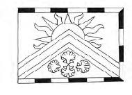
The flag is armorial in design. That is, the symbols (charges) on the shield of the coat of arms are spread (emblazoned) across the flag. A border of alternating squares of green and white (compony) has been added for apparently aesthetic purposes since no symbolic meaning has been attached to it.
The large white chevron charged with a green chevronel, represents « The Pinnacle, » a mountain and local geographical landmark on the eastern horizon of Stanbridge, The green and white colours together signify the original settlers who came to this area from the Green Mountains of Vermont and the White Mountains of New Hampshire in the 1790’s. The colours are also those of the local school and sports teams. The chevron is significant for two other reasons. It a1ludes to Captain Stanbridge as a Chevron appears on the arms of the Stanbridge family of County Sussex. The Captain is claimed to have surveyed the township in 1790 « and one legend accords the community is named for him, A chevron is also displayed on the Rice family coat of arms from which one of the villages of Stanbridge is named—Riceburg.

The four shells in the base of the flag are positioned to reflect the four compass points and are symbolic of the four villages which constitute the township around the community of Stanbridge East : Riceburg to the northwest, Puddledock to the north, Beartown and Ross Road to the east, Bunker Street, the Blinn neighborhood and Stanbridge Ridge to the south. The shells also reflect Stanbridge’s prehistoric geological past. Recent excavations in the area have revealed remains of fossilized shells, verifying ten thousand years ago this land lay beneath Lake Champlain.
The rising sun in the east beyond The Pinnacle, alluded to on the flag by the « demi sun in splendour » above the chevron, symbolizes the village of Stanbridge East, the principal community in Stanbridge Township.
Flagdata
Proportions :
2:3 (De Jure – as shown on the grant of arms).
1:2 (De Facto – actual flags displayed in the community).
Colours : A green field with a golden yellow « demi sun in splendeur » above a white chevron charged with a green chevronnel. Below the chevron point, in center base, are four golden yellow escallop shells positioned crosswise with their bases inward. The whole within a bordure compony of green and white.
For those who would like to know more about heraldry in Canada, go to the following Internet Address : http://archive.gg.ca/heraldry/pub-reg/main.asp?lang=e
